I've been spending a great deal of time looking over the first and second editions of Angeline Crichlow's Let's Tat, and have been finding a lot of things that make each book unique. I suppose it's inevitable in a self-published, hand bound book that has been written on a typewriter. That's part of what makes Let's Tat such a treasure.
What I've also noticed is just how much work Angeline put into creating each one of her books. When you factor in the amount of pages, the hand binding, the corrections that have been applied directly to the page, and the level of detail that she went through to explain each concept in tatting, it truly is a labor of love.
Let's take a look at some of the interesting things I found in each book.
Differences Between the Two Editions:
The first edition was published in 1979. 100 copies were made, each numbered and signed by Angeline Crichlow. The second edition was published in 1981 and approximately 400 copies were made. Unlike the first edition, the second edition is not numbered and the inside page has a photocopy of Angeline's signature:
 |
| Book Signatures: first edition on left, second edition on right |
The leather bound cover of the second edition came in different colors. Mine is brown, and I have seen photos of green, yellow, and burgundy covers as well. As far as I know, the first edition only has a burgundy cover. (If you have a first edition that is NOT burgundy, I'd love to hear about it!)
 |
| Book Covers: first edition on left, second edition on right |
The ribbon bookmarks also came in different colors. I have seen burgundy, red, hot pink, and green. Gold lettering on the cover has different spacing, placement, and clarity on each book.
If you turn the book to the side, you will notice "Let's Tat" hand written on the spine in gold pen. For some reason, this is missing from my first edition copy. I looked for signs of it having been rubbed off, but it looks like it was never there. This may be unique to my copy (I think
Fox's first edition has the title on the spine, as seen
in a post by Ann when the book was traveling the world).
 |
| Book Spines: first edition on left, second edition on right |
The endpapers in the first edition are plain while the endpapers in the second edition are decorated with pictures of tatting:
 |
| Endpapers: first edition on left, second edition on right |
The second edition has more pages (353 as opposed to 332). This is because a few extra patterns have been added and some unnumbered pages have been incorporated. The second edition also has an address change and other information that has been glued to the pages of the book. For the sake of privacy I'm not including any photos of addresses, but here is a page from the end of the book where additional titles have been added:
 |
| Additional book titles glued to the second edition |
My favorite page in the book shows photos of the generations of tatters in Angeline's family. This is also different in the two editions. The first edition only has four generations of tatters:
 |
| Four Generations of Tatting, first edition |
The second edition has five generations of tatters. Angeline's daughter Jeani has been added:
 |
| Five Generations of Tatters, second edition |
Look closely and you will see that Angeline's year of death has been written in blue ink in the second edition. I believe this was done by her daughter, as the same blue ink is used to correct her daughter's address a few pages back. This book must have been one of the last copies sold.
The above photo is also a good example of the print quality in the second edition. It appears to be photocopied throughout, rather than the offset printing seen in the first edition.
Correction of Typos (first edition):
Perhaps the most interesting thing about this book is the way in which typos are corrected. White out, black pen, red marker, and glued bits of typing can be seen throughout the pages (this is exclusive to the first edition). Although some corrections were done to the master copy before it was sent off to the printer, there are loads of edits done to each book by hand. Multiply that by 100 first edition copies and you will begin to see just how tedious of a job it is.
There are seven instances where typing has been cut out and glued on top of typos. Here are a few examples:
There is also a photo glued to the bottom of page 12. This was super difficult to spot (I had to run my fingers over the page to feel the extra layer).
 |
| Photo of Rose glued to bottom portion of page |
In total there are 8 glued corrections in my copy of the book. If Angeline did this with all 100 copies, that is 800 little pieces of paper that were cut and glued!
There are other types of corrections as well. White out and black pen were used to fix certain misspellings:
Later page additions, marked by the letters "xx" contain red marker to signify colored thread. I suppose this was her only option as the entire book is in black and white. Notice the white out correction on the same page:
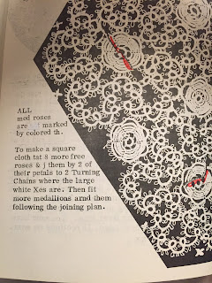 |
| Red marker used to signify colored thread |
In total, I was able to find 40 corrections applied by hand (the group of red markings above was counted as 1 correction). If Angeline made these corrections to every one of her original 100 copies, then that means she made 4,000 corrections in all. Can you imagine? I hope she had someone helping her!
Uncorrected Typos (first edition):
While carefully examining the pages of the first edition, I stumbled upon a number of uncorrected typos. Here is a sampling:
A couple of these were remedied in the second edition of the book, but for the most part, they remain uncorrected in both editions.
Other Finds
The majority of my time was spent looking through the first edition of Let's Tat. However, as I was comparing errors between the two editions, I noticed that my second edition seemed to be missing pages!
I swear I had seen page 231 somewhere, and after careful searching I found it:
Something must have happened in the bookbinding process and a few of the pages got mixed up. Luckily they are all there, just misplaced.
Stories from Angeline
Sprinkled throughout the pages of the book are stories from Angeline's childhood and adult years. I especially like the story of creating a volleyball net when she was a school teacher in Arizona:
You can really see Angeline's resourcefulness in this excerpt. This same ingenuity is what enabled her to create Let's Tat with very limited technology. I greatly admire her for it, and it's a major reason why I am such a fan of this book.
Well, that's it for this post. I hope that my analysis gives a window into just how much time and effort Angeline put into creating this book, and that her dedication will inspire some of you. It sure has inspired me!


